The history of our logo

With 150 years, Heidelberg Materials is one of the oldest German companies. During this long time, the company has had to reinvent itself again and again. These changes and adaptations were also reflected in the company name and logo. The recently announced rebranding now means the eighth name and the fifth logo in the history of our company.
The lion in a circle
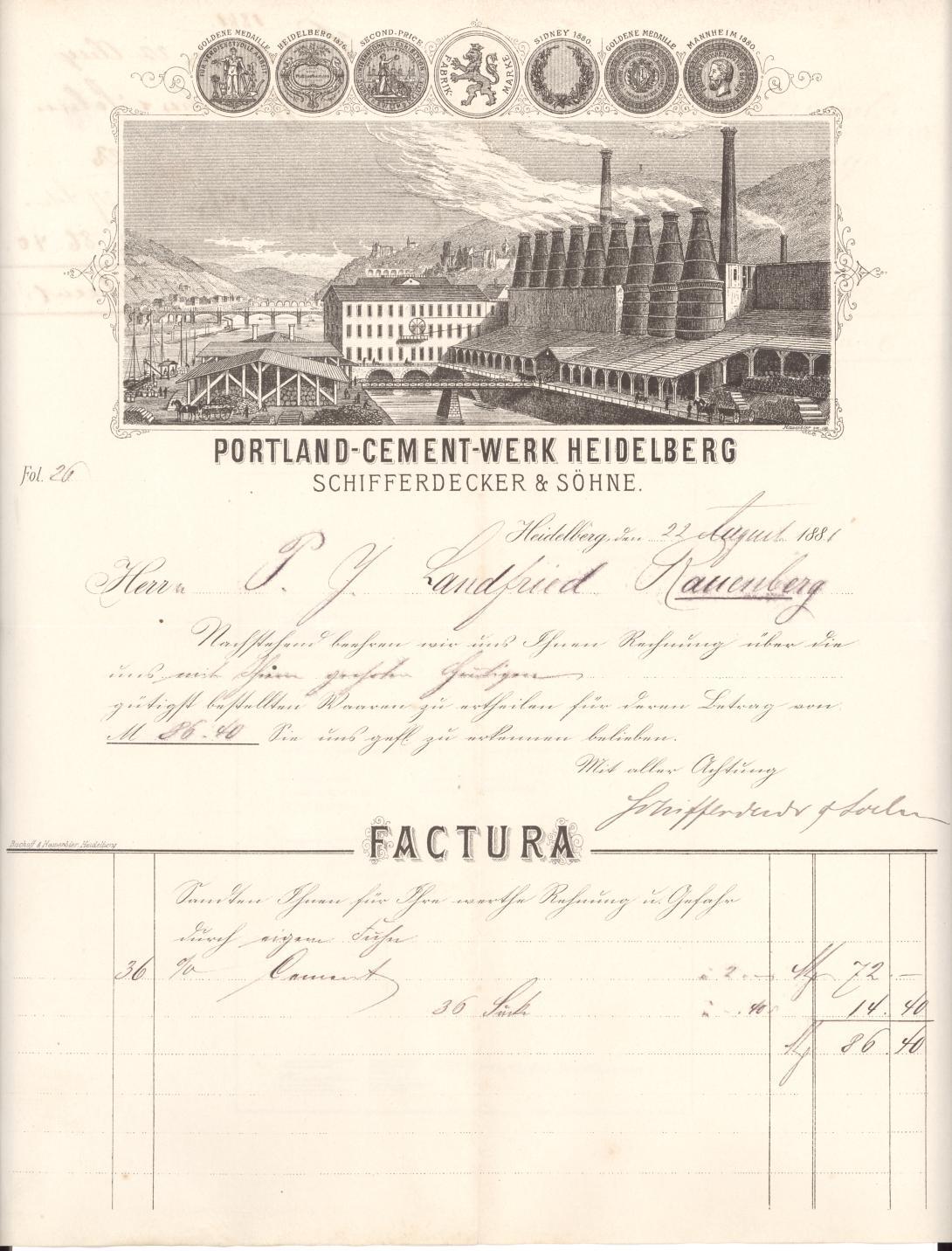
After its foundation in 1873, the young company, Portland-Cement-Werk Heidelberg, Schifferdecker & Söhne, needed a logo to present itself on the market. The company founder, Johann Philipp Schifferdecker, didn’t have to think long about the decision – a very expressive symbol could be seen everywhere in the city of Heidelberg: the Palatinate lion. In its former form with a double tail and crown, it was adopted for the cement plant.
The lion had its origins as the heraldic animal of the Wittelsbach family, who were the long-time rulers of the Electoral Palatinate and thus of Heidelberg. The double tail dates from the Baroque period, probably as a lavish decorative element in keeping with the spirit of the times or as a copy of other double-tailed heraldic lions.
The oldest depictions of the Palatinate lion as a company logo are found in an advertisement and on a letterhead from 1876 and 1881. In the former, we only see the shadow of the lion striding to the right, in the latter it is striding to the left - as it is on all coats of arms. In this second form, it was soon also used on letterheads and accordingly registered as a company and trademark at the Baden Patent Office on 14 September 1886 at 16:30. This logo - called the "lion in a circle" - remained in use for almost a hundred years, but after the Second World War mainly abroad.
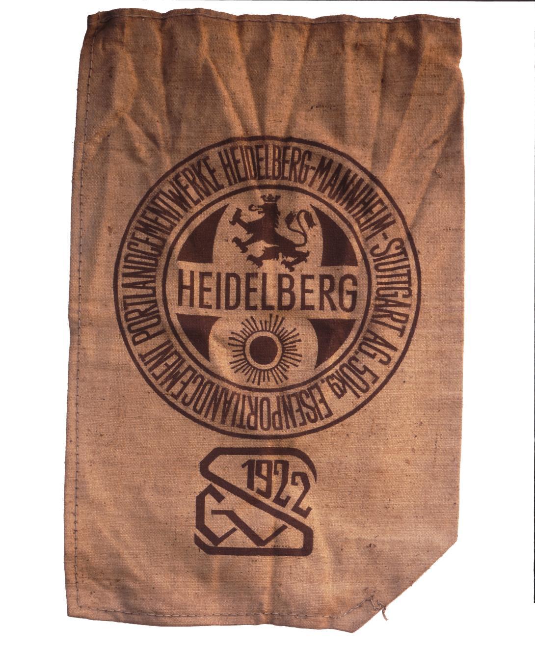
In 1901, the company merged with the Mannheim Portland-Cement-Fabrik AG, and in 1918 with the Stuttgarter Immobilien und Bau-Geschäft AG. The Mannheim company had a sun as its logo, the Stuttgart company had none. Although the "Mannheim sun" was not integrated into the official company logo (the "lion in a circle" still remained), it appeared on letterheads, barrel labels, and cement bags until 1938.
The lion in the octagon
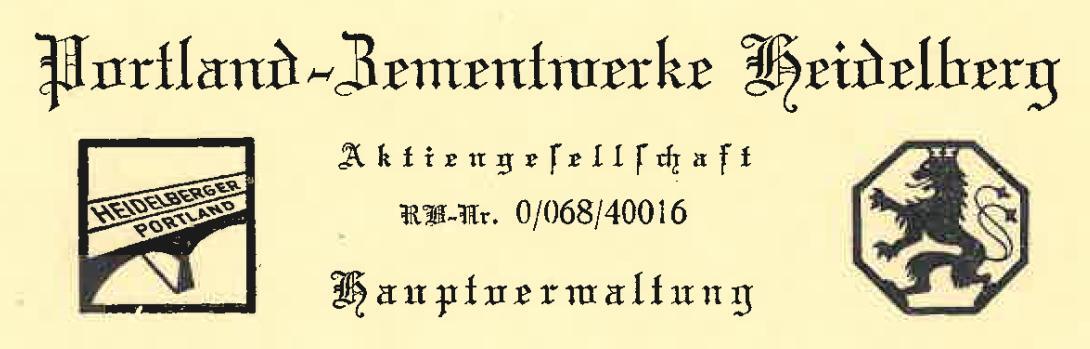
In 1938, the long company name Portland-Cement-Werke Heidelberg-Mannheim-Stuttgart was replaced by the shorter and more modern Portland-Zementwerke Heidelberg. At the same time, a new company logo was designed, the well-known "lion in an octagon". The new geometric shape originates from the design of the barrel labels, which were either round or octagonal. These shapes were well suited for sticking on the cement barrel lids. With the new logo, which also served as a new trademark in Germany, the company wanted to express the togetherness of all its by now numerous plants in Germany. It was often used without a name as a clear symbol for the company. For products abroad, the "lion in a circle" was still used, surprisingly often still with the old company name "Portland-Cement-Werk Heidelberg, vorm. Schifferdecker & Söhne".
This ended when the company changed its name again in 1978. From now on, it was called Heidelberger Zement. The trademark rights for the "lion in a circle" sign were allowed to expire and thus lapse all over the world. Only the "lion in an octagon" remained as the only symbol for the company used worldwide. Around this time, the colour green was already established in the design. It appeared around 1973, first as an additional colour in the printed company chronicle for the 100th anniversary, and shortly afterwards also in the staff magazine. Whether the green was an accidental or a deliberate choice cannot be clearly clarified, but it was in any case in keeping with the (nascent) theme of environmental awareness, which was just becoming more popular.
The company name as a logo
The acquisition of Lehigh in 1977 opened the way to internationalisation for Heidelberger Zement. After the takeover of CBR and Scancem and the acquisition of plants, e.g. in the countries of the former Eastern Bloc, the number of countries in which the company was present grew rapidly. As a result, the name had to be adapted to the international market. From 2002, the company was called HeidelbergCement.
But the question of the logo also had to be clarified. Many subsidiaries and affiliates used only their own symbol or adopted different elements from the parent company's figurative mark (e.g. only the octagon or the lion). This led to an undesirable colourful bouquet of figurative marks on the international market. The solution was a new logo. It became the name of the parent company itself, in green.
For a long time, it was considered to keep the lion as well, as it was a good logo image with a strong pictorial symbolism. But since an additional element - especially for the international subsidiaries with their own logo - would have meant graphic difficulties, they decided against it. "This step was not easy for me," said Hans Bauer, former Chairman of the Board of Management, "but the lion in the octagon will remain with us […]". In fact, it remained present for a long time in the signs of the German subsidiaries (such as Heidelberger Beton or Heidelberger Sand und Kies).
End of the "cement" era
On 20 September 2022, the Managing Board announced the change of the brand name from HeidelbergCement to Heidelberg Materials. At Group level, the new name was introduced immediately; the national and international subsidiaries will be renamed gradually since 2023. For the first time, the company will thus be able to operate worldwide under a uniform name and logo. In the new name, "Heidelberg" will remain as a synonym for continuity and market leadership. The word "Material" was already used in the logo of the "Beyond 2020" strategy. It replaces the word "Zement/Cement", which has always been part of the company name since its foundation. A new logo was presented at the same time as the name change. It consists of two organically connected elements that represent the initial letter "h" of the brand. The larger shape stands for a construction element and thus for the technical strengths of Heidelberg Materials. The smaller element is reminiscent of a leaf and symbolises the future fields of the group. The main colour of the logo remains green.